

자유글 Download the 110 best free fonts - 영문 베스트 프리 폰트 강추!!
-
 운영자
운영자 - 8383
- 2
첨부 1
UPDATED: Get your hands on the best free fonts, from vintage-inspired typefaces to slap-you-in-the-face slab serifs!
Typography isn't just about communication, it can also add subtle references to the message you're trying to convey. From tattoo fonts toedible typography, it's a rich and varied subject. Whole books have been written on the craft and nuanced world of typography and type design, but fear not, because we hope to take the pain out of finding the best free fonts.
In this article we've scoured the web to present you with a fine and varied selection of the ultimate free fonts. Including scripts, serifs, and a range of ligatures, these fonts will give you greater flexibility in your designs, and add to your arsenal of design tools.
Pre-flight check
Some of these fonts can be used on your web projects, but check the terms. And if you're looking at a quick primer on using web fonts, we explain all here.
So, without further ado, join us as we present you with 110 of the best free fonts, which you can download and use today. Let us know how you get on!
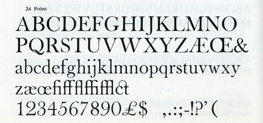
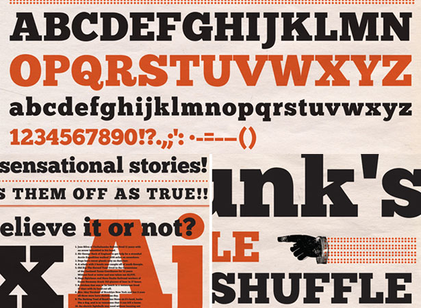
01. Riesling
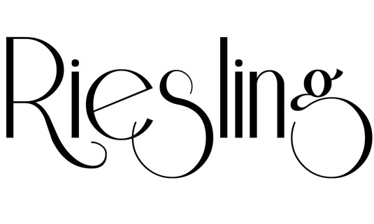
Transport your designs back to the 1920s with this beautiful free font created by Bright Ideas. The elegant typeface includes a full set of upper and lowercase letters, numbers 0-9 and special characters.
FORMAT: TTF
02. Agilis
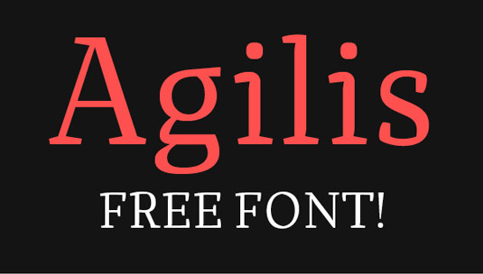
Agilis is the product of Swiss type designer Nico Inosanto. Initially created as a display font, Inosanto realised his typeface worked better as a smaller design. This free font has an extended character set to support Central, Eastern and Western European languages.
FORMAT: TTF
03. Highlands
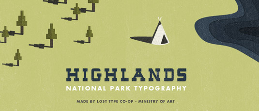
This cool retro typeface was created by web and UI designer Tyler Galpin, a runner-up for Young Designer of the Year in this year's .net Awards. He describes the free font as "a charming slab-serif that draws inspiration from National Park posters of old". It's been available as a download on Lost Type Co-op, with any donations to its creator gratefully received.
04. High Tide
Design student Filipe Rolim developed this typeface due his need for having a more alternative font to use in his projects. And now he's generously offering his design as a free font for all to enjoy.
FORMAT: TTF
05. Soul Mission
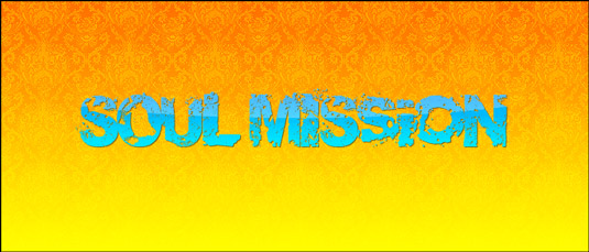
An artist who goes by the name of RoCU is the brains behind this cool free font. The grunge font design has amassed over 750,000 downloads since its release. Rocu generously offers his creation free for use in both personal and commercial projects.
FORMAT: TTF
06. Infinity
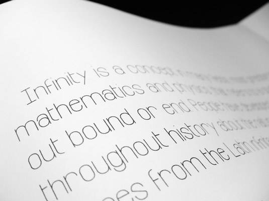
Infinity was created by Bangkok-based graphic designer Tarin Yuangtrakul. Inspired by the number 8 and the infinity symbol, this free font was created for use in print design, web design and motion graphics.
FORMAT: TTF
07. Kilogram
This free font was created by KalleGraphics and based on Nick Curtis' font Anagram. The bold design includes a full set of upper and lower case letters, numbers and special characters. Free for personal use.
FORMAT: OTF
08. Construthinvism
Pedro Fernandes and 4838Design are collectively responsible for free font Construthinvism. Fernandes describes the design as being "inspired by the Russian Constructivism, Cyrillic characters and Alexander Rodchenko".
FORMAT: OTF
09. Molesk
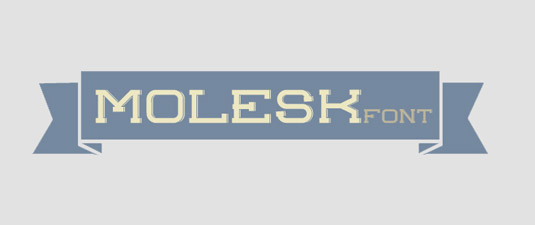
This vintage-style free font was designed by communication and multimedia student Pedro Lobo. A slab serif font with shadows on the right, the design includes a full set of uppercase letters, numbers and a selection of special characters.
FORMAT: TTF
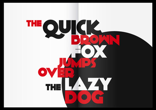
10. Bigmouth
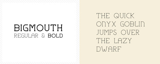
Bigmouth is a free font offered by Twelve Twenty, the creative home of designers Timo Kuilder, Jankees Van Woezik and Eric-Paul Lecluse. The typeface is available in both regular and bold versions. All the team ask for in return for the download is a simple tweet.
FORMAT: OTF
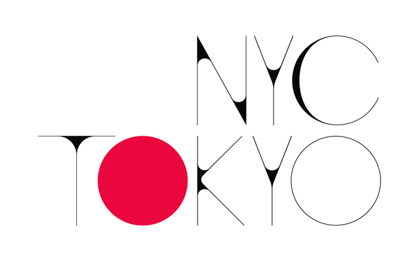
11. Tracks
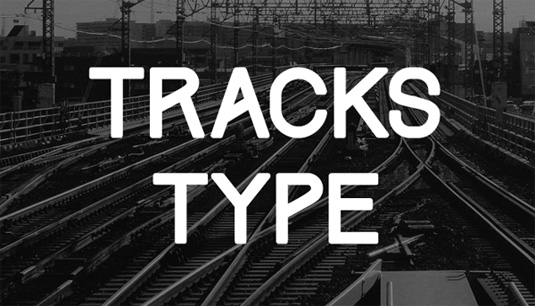
Tracks type is all caps fonts and alphabet only, inspired with railway tracks slash, static, dynamic, and clean. It was designed by Indonesia-based design student Gumpita Rahayu and is available in two different styles - medium and slanted. It was designed for display purposes, so this one will look great when used for headlines.
FORMAT: OTF, TTF
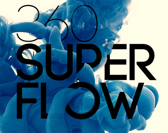
12. Sequi
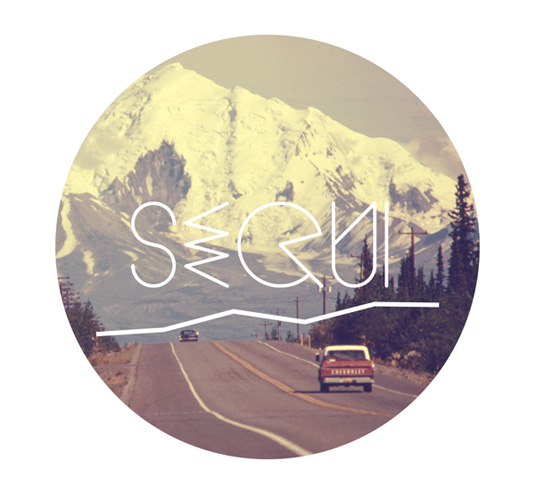
Sequi is an experimental, personal project by Portuguese designer João Andrade. The name comes from the Latin and includes a total of 360 glyphs. It's free in all its weights - light, regular and bold.
FORMAT: OTF
13. Ziamimi
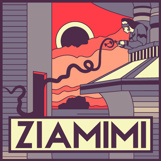
Ziamimi is a gorgeous font that comes in capitals - making it perfect for headers and eye-catching statements. Its sleek finish allows it to really stand out as one of the best free fonts we've come across. It also comes with numbers and a few punctuation marks.
FORMAT: OTF
14. Dooodleista
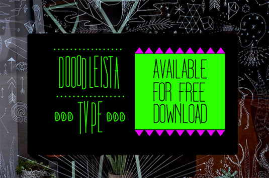
Why Doodle? This question can be answered with two simple words - for fun. This is the first and most important rule that designer Filiz Sahin has set out for anyone that uses this brilliant free font. We love its playful style and doodle art feel. Download this font for free if you're looking to experiment!
FORMAT: OTF
15. Klinic
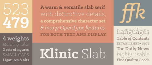
In four weights (and italics), the eight-font Klinic Slab family is one ofLost Type's most comprehensive releases to date. A contemporary, versatile slab serif, Klinic is a workhorse that marries personality and functionality. Designed by Joe Prince, it's free to download, but if you decide to use it then we'd encourage you to make a donation.
FORMAT: OTF
16. Albert
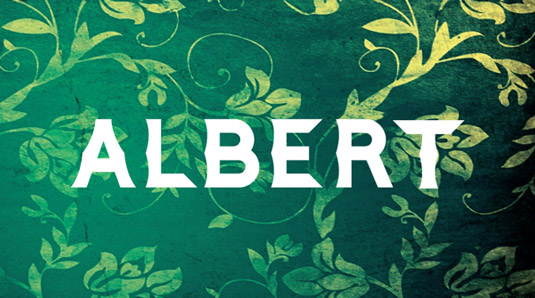
Albert is the latest offering from 22-year-old, London College of Communication design student William Bayley Suckling. One of many designs created by the talented creative, Albert is a new decorative headline typeface, inspired by Victorian signage and lettering.
FORMAT: TTF
17. Before Breakfast
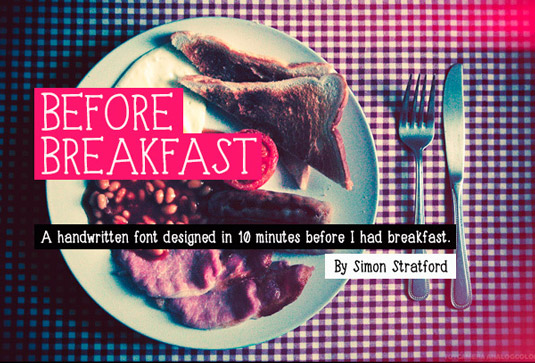
Recently, designer Simon Stratford discover iPad app iFontMaker and shortly after challenged to create a font with it in under 10 minutes. The result? This free, hand drawn typeface Before Breakfast. Stratford comments online: "It's a fun, handwritten typeface that probably breaks every rule in typography."
FORMAT: TTF
18. Yuma
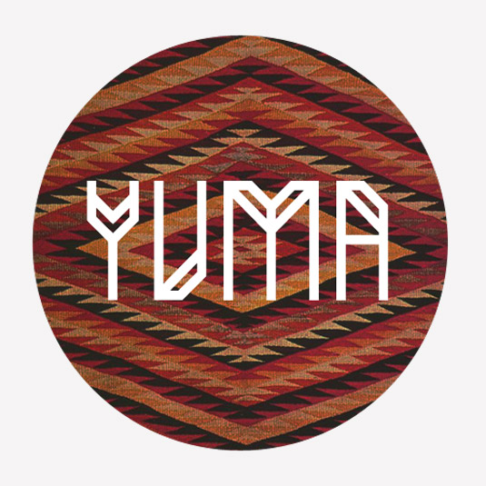
Yuma was developed by Indonesia-based graphic designer Gumpita Rahayu. The designer comments online: "Yuma is an experimental font with straight glyph, inspired with typical Navajo textiles, which have strong geometric patterns." Available as a free download, all Rahayu asks for in return is a tweet or Facebook post.
FORMAT: TTF
19. Muchacho
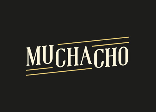
Designer Jeff Schreiber describes his typeface Muchacho as "a western-style serif font with quirky legs". Based in the Netherlands, Schreiber's design contains all capital letters, numbers, diacritical marks and most punctuation marks. Muchacho is a free version of his Wild West-inspired typeface Gringo.
FORMAT: TTF
20. Cylburn
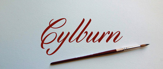
You can find semi-connected script font Cylburn on Lost Type Co-op. Designed by Dai Foldes, the artist comments on his creation: "Cylburn is a semi-connected script, structurally based on Roundhand but written with a pointed brush and restrained tension that separate it from its traditional roots." Free for personal use, however, donations are always gratefully recieved.
FORMAT: OTF, TTF
21. Lovelo
Designed by Austrian typographer Renzler Design, the Lovelo font is a remake of the original Lovelo Inline. It's a geometric sans serif typeface with two line versions, making it an eye-catching choice for any large text or headlines. As always, the font is free but there is a donation option if you'd like to show the designer your appreciation.
FORMAT: OTF
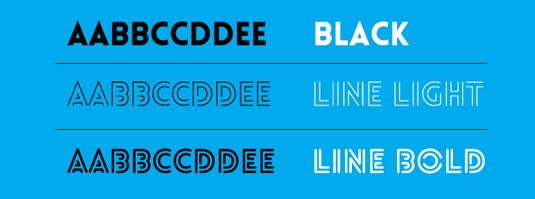
22. Iron
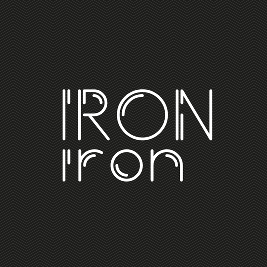
Introducing Iron, a new Sans Serif Typeface for you all to download for your free personal use copy. Designed by 22-year-old William Bayley Suckling, Iron is an original and playful font that will be perfect for all your design experiements. You can also purchase the font for commerical use.
FORMAT: TTF
23. Fairview
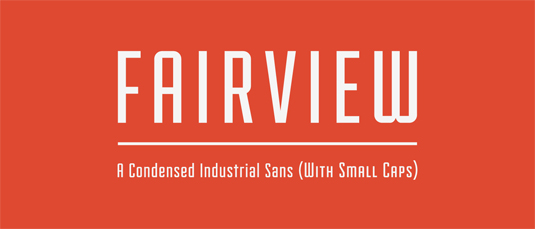
Fairview is a condensed sans serif, with small cap alternates, inspired by the industrial lettering of the 20th century. Designed by Riley Cran for the Lost Type Co-op, the font comes in uppercase, lowercase, numerals and punctuation. There's also a donation option with this font, so be generous and show your appreciation!
FORMAT: OTF
24. Zwodrei
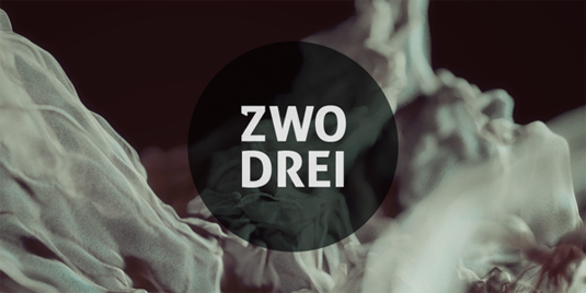
Perfect for personal headline use, Zwodrei was designed by 27-year-old German based graphic designer Lukas Bischoff. After graduating from his studies of communication design at the University of Applied Science, Lukas has gone on the create some beautiful typefaces - including this one!
FORMAT: OTF
25. Distractor
Distractor a new typeface designed by London-based graphic designerSimon Stratford. Loosely based on Bevan, the inspiration behind this font was the old letterpress styles and hand printed lettering - a passion of Simon's. Use for personal projects and be sure to let Simon know what you think of it!
FORMAT: OTF
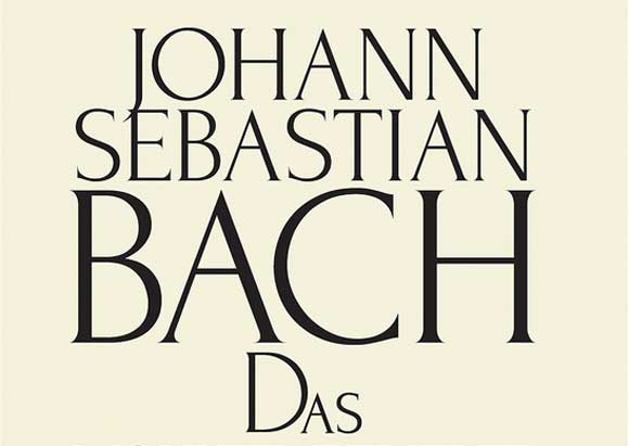
26. Linux Libertine
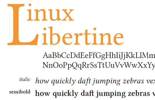
Linux Libertine was designed by the Libertine Open Fonts Project and, according to Wikipedia, 'aims to create free and open alternatives to proprietary typefaces such as Times Roman'. The font is licensed under the GNU General Public License and the SIL Open Font License, and contains more than 2,000 glyphs and includes character sets such as the Greek Alphabet, Cyrillic script, and Hebrew.
FORMAT: TTF, OTF, WOFF
27. PApier Sans
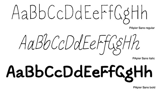
This crafty little handwritten entry in our free fonts list comes to us courtesy of SMeltery, the French independent font factory. Founded in 2002 by Jack Usine, SMeltery hosts a number of fantastic fonts, but this new addition to its library really drew us in (get it?). Coming in regular, italic and bold, this font is free for both personal and commercial work.
FORMAT: OTF
28. Museo Sans 500
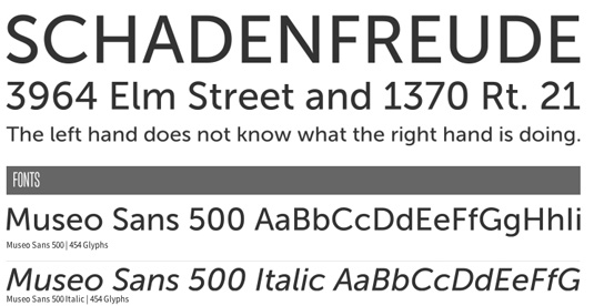
This extremely popular font is part of the Museo family of fonts, and you can get both the Sans 500 and Sans 500 Italic versions for free. You can either get one desktop license, one web font license for 500,000 page views, or a combination of the two. Registration is required to access the fonts.
FORMAT: OTF, TTF, EOT, WOFF, SVG
29. Museo Slab 500
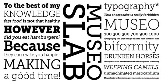
If you thought a free Museo sans font was good, we've also got two Museo Slab variants to accompany it. If you're looking for an impactful heading font, this could be it. As with the Sans versions above, you can either get one desktop license, one web font license for 500,000 page views, or a combination of the two. Registration again required to access the fonts.
FORMAT: OTF, TTF, EOT, WOFF, SVG
30. Lobster
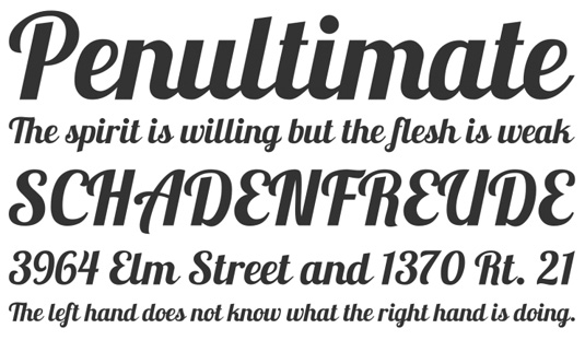
We love Font Squirrel. It's a brilliant resource for free fonts, and this is one of its hottest properties over the last few years. Chances are you've seen this font, and never realised that you could use it both on and offline at no cost. Lobster is a compact and legible calligraphy-based script font that works in both upper and lowercase, and can also be used on the web. Definitely one to snap up!
FORMAT: OTF, TTF, EOT, WOFF, SVG
31. Bevan
This is Vernon Adams' reimagining of a traditional 1930s slab serif by Heinrich Jost. The letterforms have been digitised, reshaped and optimised for the web, with more open counters and stronger stems to ensure that Bevan functions as an ultra-bold display font that suits modern browsers.
FORMAT: TTF
32. Typode
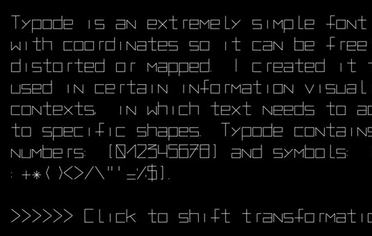
You'll either love or hate this experimental new font created by typographer Santiago Ortiz. Typode's characters are defined by coordinate, which means you can skew, stretch and twist the font to your heart's content.
FORMAT: TTF
33. Roboto Slab
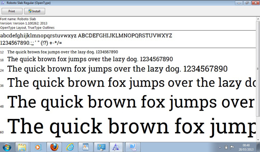
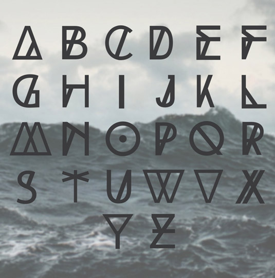
Google has released a new serif font, Roboto Slab, which it's using in parts of the mobile version of its new notetaking app, Keep - and has made it available for anyone to download and use in their own projects. The typeface is available in four versions; thin, light, regular and bold.
FORMAT: TTF
34. Sketch Block
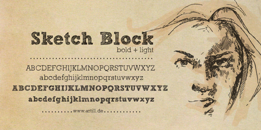
This hand-sketched headline font was designed by artist Lukas Bischoff. He comments: "Created solely by me from sketch by hand and then digitized, Sketch Block makes a perfect font to create the hand-made character look, or to supplement illustrations with typography." Available free for personal use only.
FORMAT: TTF
35. Govote
Craig Ward, a British designer and art director based in New York, is known primarily for his pioneering and experimental typographic works. He created this free font last year in support of the GoVote campaign, which aimed to encourage people to vote in the US presidential election.
FORMAT: TTF
36. Langdon
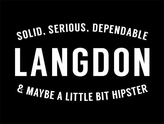
Langdon is a free typeface from XLN Telecom and leading graphic designer, illustrator and typographer Steven Bonner. The result of the collaboration is a typeface that is solid, serious and dependable. Langdon is available as a free download and can be used privately and commercially with no restrictions on usage.
FORMAT: OTF
37. Bohema
An Art Deco font with a modern twist, Bohema was created by graphic designer and illustrator João Oliveira. Perfect for retro designs, Bohema is ideal for headlines, editorial letterings, branding, merchandising and special occasions. Available in eight distinct styles, payment is required for the full set but Oliveria generously offers the regular alternative style demo as a free download.
FORMAT: OTF
38. Airbag
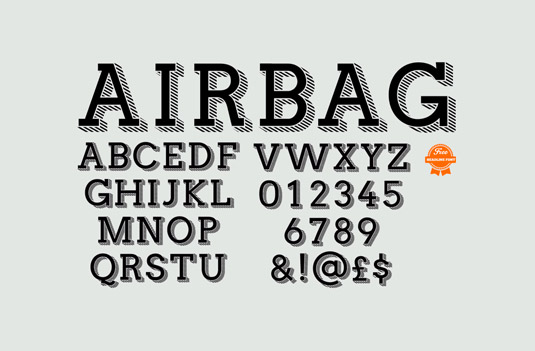
This trendy display typeface was created by designer Simon Stratfordafter he failed to find a free font online suitable for his artwork. The slab serif typeface is the Stratford's first, the designer creating a full set of uppercase letters, numbers and a few special characters. And all he asks for in return for the download is a simple tweet.
FORMAT: TTF
39. Fail
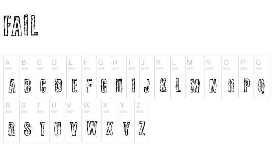
This grunge typeface does anything but what its name suggests, having been downloaded hundreds of thousands of times since its release. This is one of 129 fonts designed by Douglas Vitkausk, whose work has amassed over 12 million downloads collectively! Free for personal use only.
FORMAT: TTF
40. Ink In The Meat
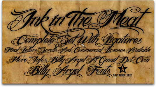
Type designer Billy Argel is the man behind tattoo font Ink in the Meat. Argel has created numerous fonts and this is one of his most popular downloads. The free version (for personal use) of this font is partial and doesn't contain any numbers. Ink in the Meat commercial licenses are available on Argel's website.
FORMAT: OTF
41. KanKin
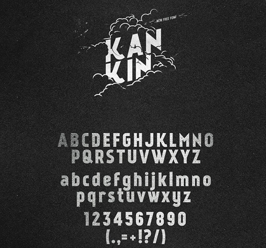
The designer of this contemporary yet 'old style' sans serif, Alexey Frolov, claims it's perfect for posters, logos, print and web. It's certainly clean and bold, and it's no surprise, given the nationality of the font's designer, that the Russian characters look particularly good in this set.
FORMAT: TTF and OTF
42. Nexa: light and bold
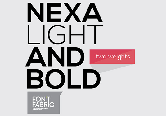
The Nexa font family includes 16 styles and weights. The font family has great legibility, and works very well as a headline font. Here you get two parts of the family for free, and if you want the rest then you'll have to put your hand in your pocket.
FORMAT: OTF
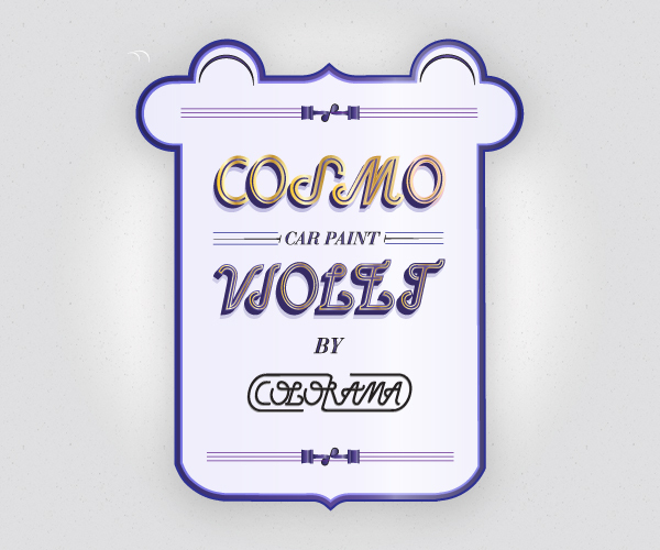
43. Grand Hotel
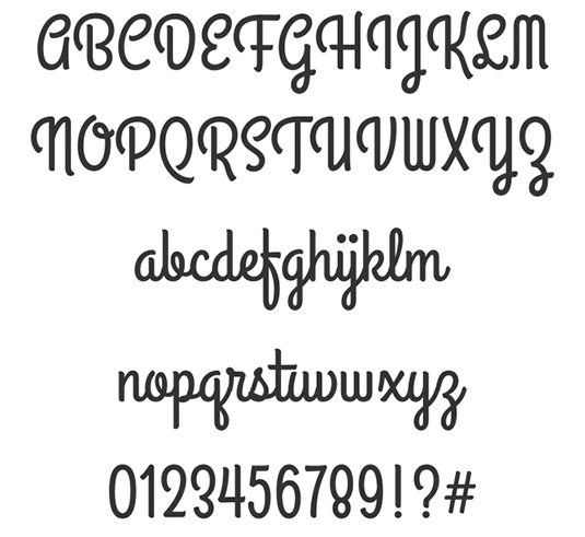
Designed by Brian J Bonislawsky and Jim Lyles for Astigmatic, this font takes its inspiration from the title screen of the 1937 film Cafe Metropole starring Tyrone Power. It has a classic weight and subtlety that make you think of artisan signage and craft, but its cursive lowercase lends itself to a host of different uses.
FORMAT: OTF
44. Moonshiner
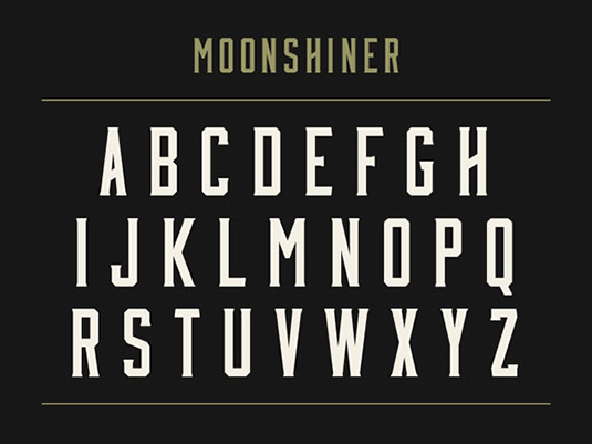
Mattox Shuler designed this font in a few days, and it lacks accents and support for some common characters, but as a heading font - especially for graphic design work - it's a great, free option.
FORMAT: OTF
45. DECO NEUE
DECO NEUE is a typeface designed by Jonatan Xavier. It's completely free for both personal and commercial use, and this sharp sans serif, with its unusually low crossbar height for certain letters, instantly evokes the 1930s. This font smacks of Art Deco, which dominated the decade, and become the prevailing interwar design movement.
FORMAT: TTF, OTF
46. Oranienbaum
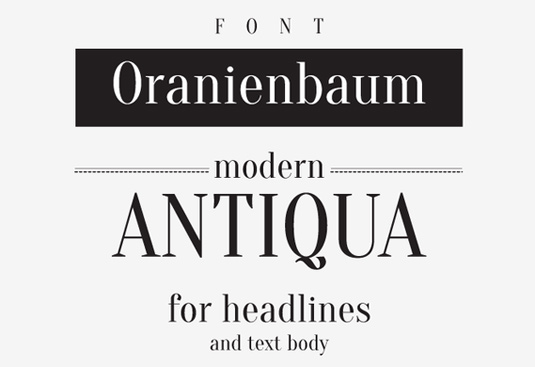
Described as 'modern Antiqua' (a group of classic 'old style' typefaces), Oranienbaum has been created by Ivan Gladkikh and Oleg Pospelov. And as free fonts go, it's a corker! Based on classics like Bodini, this font has pronounced serifs and makes a great headlines.
FORMAT: TTF
47. Barkentina
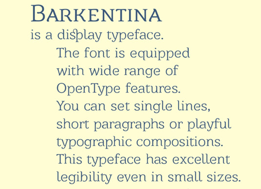
Touted as an elegant, Art Deco-style display face, Barkentina was created by Kiril Zlatkov. The font has a full set of correct Bulgarian Cyrillic letters, some lovely ligatures, and is packed with personality.
FORMAT: OTF (Free for personal use.)
48. Source Sans Pro
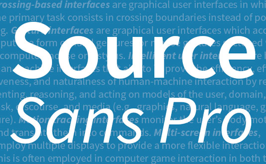
This is Adobe's first open source font family, released in 2012, and was designed by Paul Hunt. Optimised for use in user interfaces, Source Sans Pro has great legibility, and is also one of the web-friendly free fonts available via Google Web Fonts.
The family currently includes six weights, from ExtraLight to Black, in upright and italic styles, and offers language support for Latin script, including Western and Eastern European languages, Vietnamese, pinyin Romanization of Chinese, and Navajo (something Paul Hunt particularly proud of).
FORMAT: OTF, TTF
49. Source Code Pro
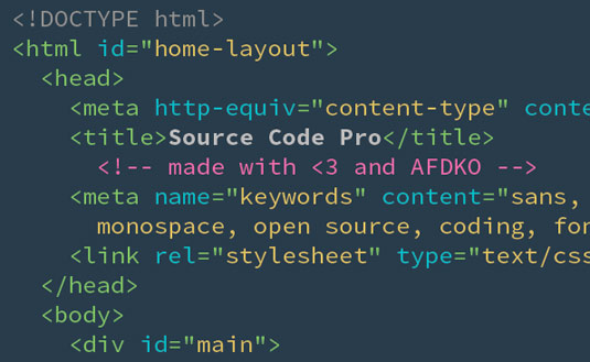
Hot on the heels of Source Sans Pro, Adobe's first open source typeface, comes Source Code Pro - Adobe was all over free fonts in 2012! As you may have guessed from the name, this font is geared towards people looking for a font to use in a dev environment/interface or similar (as it's monospaced, which means each character takes up the same horizontal space). To put it more simply, it's a code font. But it's a great code font.
FORMAT: OTF, TTF
50. El&font Block
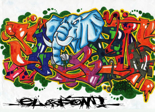
Typeface designer Jérôme Delage is the brains behind this brilliant graffiti design - El&font (see what he did there?) Block. A member of Dafont.com - the archive of freely downloadable fonts - Delage is the author of eight typefaces on the popular site, which collectively have been download over 7million times!
FORMAT: TTF
51. Archive
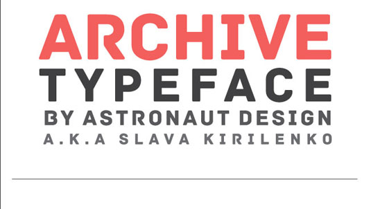
This contemporary font has been created by Slava Kirilenko, a graphic designer from Kazakhstan. In the shape of Archive, he's put together an impactful typeface, which is great for use in projects that require a ballsy display font.
FORMAT: OTF
52. Acorn
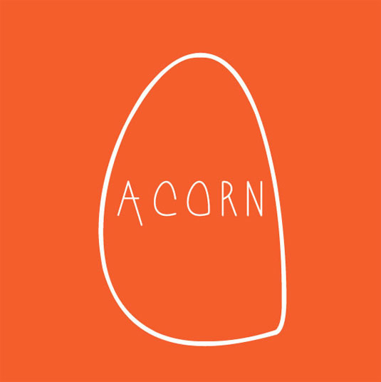
A simple sans-serif hand drawn typeface, Acorn was designed by design student William Suckling. His design ethos, is to use only what is essential, no whistles or bells, just good, clean and fresh design, allowing ideas to take form without any fuss. Acorn does just that; it's a simple, handwriting-inspired font that's perfect for any personal projects.
FORMAT: TTF
53. Benthem
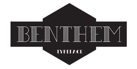
Benthem is a custom font designed by Keith Hayden. It comes in both regular and bold types, making it great for headings and posters. Hailing from Kansas City, USA, Keith has been working in design for a number of years and has quickly gained popularity on Behance.
FORMAT: OTF
54. Weston
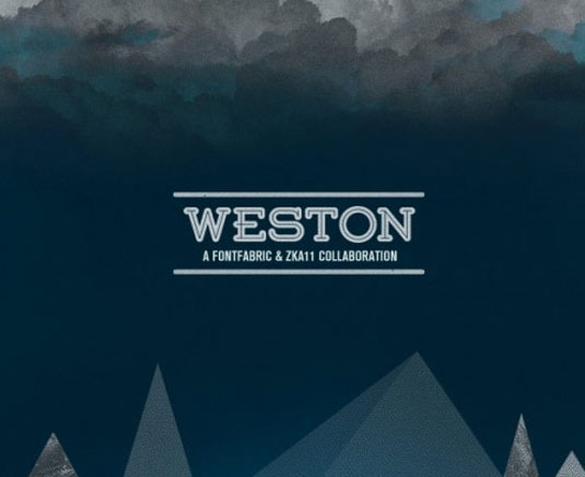
The main purpose is to provide designers with a font, suitable for modification in logos and headlines. Combined wisely, Weston will spice up your design adding the "not-your-usual-font-choice" effect. Inspired by the evergreen Grover & Rockwell, Weston works on a pay-what-you-want basis, so we would always recommend that you donate towards the designer!
FORMAT: OTF
55. Locksmith
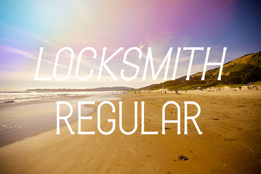
This gorgeous font was created by California based designer Kenji Enos. Having worked on everything from print, web, motion graphics, animation, video editing and 3D modelling, it's clear that Kenji has some serious talents when it comes to typography. You can grab the regular format of Locksmith for the mere price of a tweet or Facebook share!
FORMAT: TTF
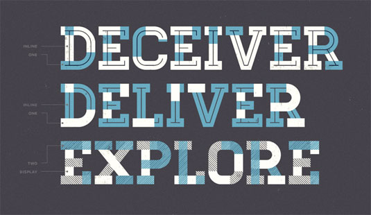
56. RBNo2
RBNo2 is inspired by late 19th century industrial fonts with German roots regarding straightness and geometry. Combined with other sans serifs, slab serifs and serif fonts it catches the eye when used in headlines and short copy texts.
Added to the regular styles the alternate versions will turn the font into a perfect partner for modern, technical and contemporary impressions as well as high quality, luxury and timeless environments. You can grab the light and light alternative formats for free!
FORMAT: TTF
57. Bariol
Designed by Spanish studio atipo, Bariol has already proved a massive hit with designers across the board. Crafted with versatily and readability in mind, the brand new, slightly rounded typeface is available in four weights.
The font is readable even at small scales and can be used as corporate typography, packaging design, infographics and even editorial design. You can download Bariol regular and italic for free by just paying with a tweet or you can get the complete font family from as little as €3!
FORMAT: OTF
58. Urban Jungle
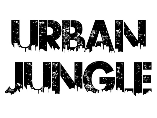
This big, bold typeface 'Urban Jungle' was created by designer Kevin Christopher of KC Fonts. The eye-catching design is perfect for creating stand-out graffiti-style posters and flyers. There's a charge to get hold of the full font but you can do personal work to your heart's content with this free demo version.
FORMAT: OTF
59. Dude
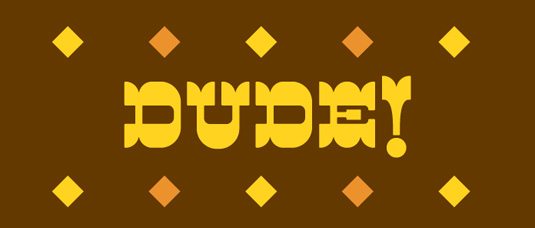
Dude is a reverse contrast cowboy font that's got true grit. It's not about weight, it's about style. There are 12 different serif styles inspired by country music legends - whiskey drinking, train hopping, fist fighting, hard loving, prison breaking men and women, who poured their hearts out in song. Designed by typographer and regularLost Type contributor Dan Gneiding, Dude consists of uppercase, numerals and punctuation. You can download the font for free or donate any price you wish.
FORMAT: OTF
60. Miso
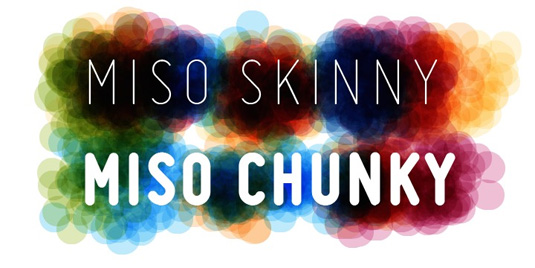
Miso was designed for architect's drawings by Mårten Nettelbladt. It's a clean and narrow typeface that's suitable for small text but also for headlines and logos. The spacing of the font follows the logic of mono-stroke fonts as found in CAD software. You can get the Miso font in chunky, bold, normal and light for absolutely free. If you want the chunky version you'll have to fork out a mere $10.
FORMAT: OTF, TTF
61. Blanch
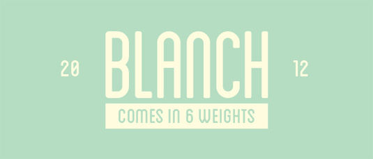
Another font offering from those lovely folks at the Lost Type Co-op. Blanch is a display face, designed for the 'Fruita Blanch' brand, a family-run company. A traditional font with a contemporary feel, The Blanch typeface family is comprised of six weights: three condensed weights and three caps weights. As always, you can download it for free but we would always encourage donating some pennies!
FORMAT: OTF
62. Cubic Sans
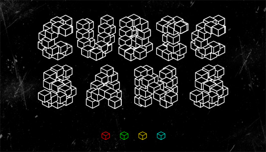
This may not be the most readable font we've ever come across but we think designers could have a lot of fun experimenting with this one. Just try to ignore the whole 'Comic Sans' inspired thing... Created byMarc Vila, Cubic Sans is a new display font based on the original Comic Sans, created by modifing its strokes using a cube as a brush. It looks really geometric and gives the effect of a 3D typeface.
FORMAT: TTF
63. Geogram
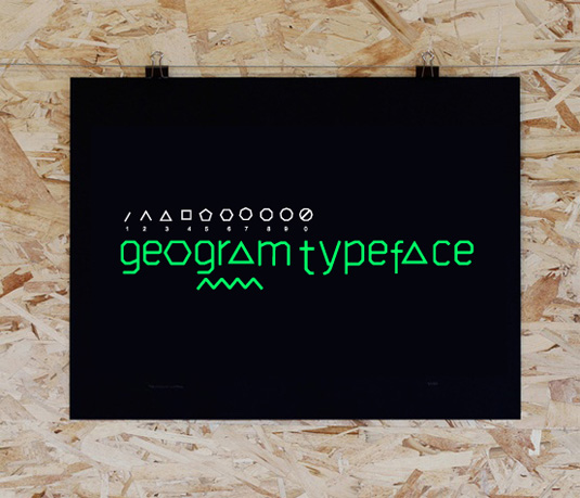
Designer Filiz Sahin crops up a lot in this list and it's easy to see why. Her experimental, quirky, and fun typefaces are perfect for playing around with and may even lead to some great work. Geogram typeface is a new font exploration based on modern shape geometric forms. The font contains lower case letters and numbers of the shapes. You can download the font for free but remember to 'appreciate' it on Behance!
FORMAT: OTF
64. Manteka
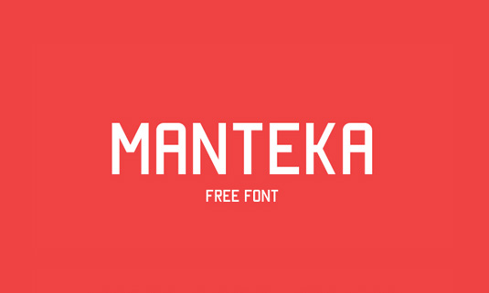
Manteka is designed by Spanish typographer Eduardo Araya and was crafted especially for use in print, but equally has a spectacular web performance. The free font has already proved very popular with designers across the globe.
FORMAT: TTF
65. Mission Script
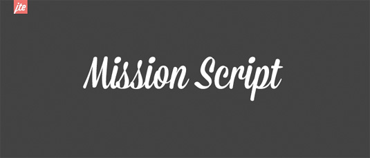
Designed by James T Edmondson, this is the first of the Mission Collection to feature on the Lost Type Co-op. Mission Script is a signage-lovers wet dream; condensed, casual, sweet, and sincere. A celebration of the brush. Scripts rule! It's on a pay-what-you-want basis for personal use, so be generous!
FORMAT: OTF
66. Geared
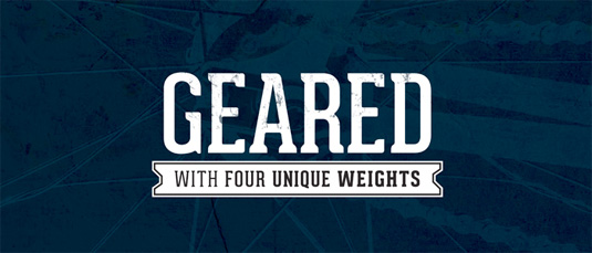
Geared is an industrial inspired Condensed Slab Serif that comes in four weights - thin, regular, bold and extrabold. It was designed by graphic designer Ben Dalrymple and with such an extensive character set, Geared could be a versatile addition to your next project.
FORMAT: OTF
67. 400ml Type
This 400ml typeface was designed and created by student Marco Terre. Currently completing his degree in communication design at the university of applied sciences in Berlin, Marco's aim was to create a clean and little playful type and is based on the idea of combining graffiti glyphs with graphic glyphs. The font comes in four styles: regular, bold, regular italic and bold italic. It's perfect for almost any type of use, including poster work, web design and illustration.
FORMAT: OTF
68. Ghang
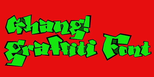
Måns Grebäck is a graphic designer who specialises font, logotype and typography design. He developed this brilliant graffiti-inspired design Ghang, as well as a host of other typefaces in this particular style. The demo version of Ghang is available as a free download or the full font can be purchased for $59 on Grebäck's site Mawns .
FORMAT: TTF
69. Johanna
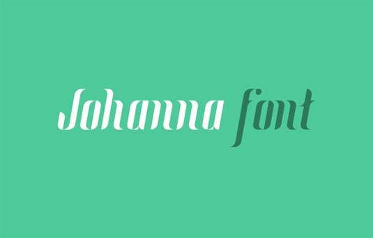
Johanna is a modular typeface based on six basic modules and as a result, there are 147 glyphs of versatility in each style. It was created by Spanish graphic designer Adrià Gómez and also comes in an italic version. We love the slight vintage feel to this one and think it could be used best in web design. The colours that Gómez has used to showcase the font are also a brilliant touch.
FORMAT: TTF
70. Silverfake
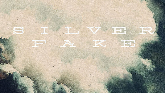
Silverfake is a new contemporary slab serif wide free font designed Alexey Frolov, aka MRfrukta. This vintage font is presented in contemporary curves that make the font applicable for both retro and modern designs. Silverfake contains only capital letters but also some alternate characters are also included. Check back to Alexey's site regularly, as he has a host of free fonts up for grabs.
FORMAT: OTF
71. Typometry
This quirky font was crafted by Emil Kozole for a university project. A lover of 'pretty colours', Emil manages to encorporate quite a surrealist style into this type face. Typometry will be a great font to experiment with in a number of projects. The font is now a pro version with two weights, four styles and more than 220 glyphs that are available in both TFF and OTF format.
FORMAT: TFF, OTF
72. Che's Bone
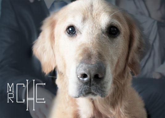
This gorgeous font was created by Filiz Sahin. She says of the font, "My dog loves bones. I experimented with this font for Che and other dog lovers. It has round edges and condensed skinny forms. The corner of each letter has a bone shape which is Che's favorite part. I hope you enjoy it as much as I do!" It is free for personal and commercial use and Filiz would be grateful for credits!
FORMAT: EPS
73. Mood Type
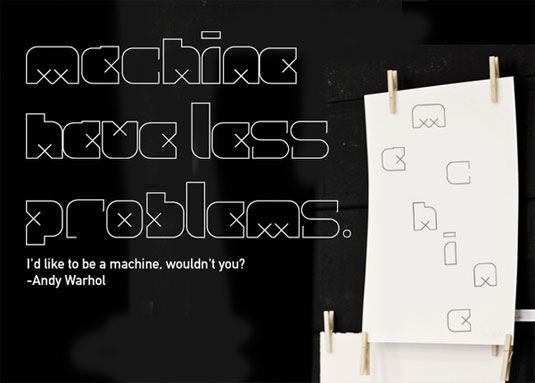
This is another brilliant design from Filiz Sahin. The project was inspired by Modern Swedish Furniture, print mechanical instructions - crops, bleeds, and registration marks - as well as pop influenced '70s fonts. This is an EPS font for display font purposes only, at the moment. There are no PostScript or OpenType versions available. Please do some nice and clean work.
FORMAT: EPS
74. Homestead
An evocative yet forward thinking slab, Homestead is another stunning creation from the guys at Lost Type. Inspired by their desire and need to explore, Homestead represents the ways in which we are always searching for the place to call home. Designed by Luke Lisi, Homestead comes in uppercase only with numerals and punctuation.
FORMAT: TTF
75. Habana
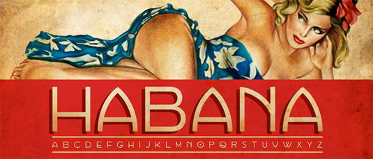
Habana is a geometric sans-serif inspired by Cuba's capital city. Available only in uppercase, this curvy offering was designed by New York based designer Bonnie Clas. What's more, Bonnie didn't only design the font but she also crafted the sultry illustration that showcases the typeface. That's one talented lady right there!
FORMAT: TTF
76. CODE Pro
Code Pro is a font family inspired by the original Sans Serif fonts like Avant Garde or Futura, but with a modern twist. It is clean, elegant, and straight-to-the-point. Code font is applicable for any type of graphic design - web, print, motion graphics, etc - and perfect for T-shirts and other items like posters and logos. It also comes in a number of languages!
FORMAT: OTF
77. Adamas Regular
Created by Romanian graphic designer Octavian Belintan, the Adamas style was first used by Greek and Latin writers for a stone of impenetrable hardness. Adamas only comes in upper case but we think it's a great free font to experiment with!
FORMAT: OTF
78. Jura
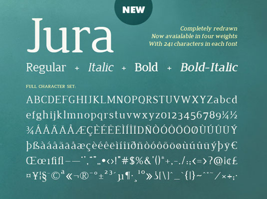
This gorgeous font was created by designer Ed Merritt and is available on Ten by Twenty. A designer and front-end web developer, Ed hails from Bournemouth and regularly works for website developing company Headscape. This new release of the Jura family includes regular, italic, bold and bold-italic fonts. Each variant includes 241 characters with a couple of ligatures thrown in. What's more, it maintains legibility even at small sizes, unlike other serif fonts. Ed built the metrics and kerning from scratch too!
FORMAT: TTF
79. Tikal Sans
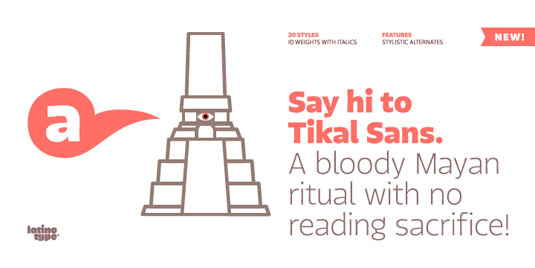
Designed by typographer Miguel Hern·ndez, Tikal Sans is a beautifully designed type that's part of the new font family Latinotype. Miguel also works as a graphic designer, illustrator and typography teacher and currently resides in Santiago, Chile. The font comes in 20 variations, including Ultra Italic, Bold and Extra Light but you only receive the Medium and Italic in the free package. You can however, pay $329 for all 20 fonts. Tikal-Sans offers a functional look with a contemporary large x-height with opentype contextual alternate letters.
FORMAT: OTF
80. Open Baskerville
Open Baskerville is an open source project focused on creating a digital revival of the famous 'Baskerville' typefaces based on Fry’s Baskerville; a Baskerville-inspired derivative created by Isaac Moore, the punchcutter who worked for the type foundry of Joseph Fry. The team at Open Baskerville are dedicated to bringing you typefaces that will actually make an impact on your design work and continue to be useful to you.
FORMAT: GIT
81. Fabrica
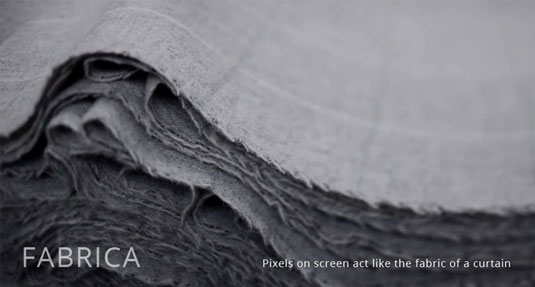
Created by Canadian designer Alvin Kwan, Fabrica was designed with one thing in mind: to create the most legible typeface for mobile screens. In a world where people read more text on their smartphones and tablets, rather than on actual paper, Fabrica is a typeface that's well worth looking in to. Although the download is free for all, you can also donate however much money you would like to Alvin for his work.
FORMAT: OTF
82. The Fell Types
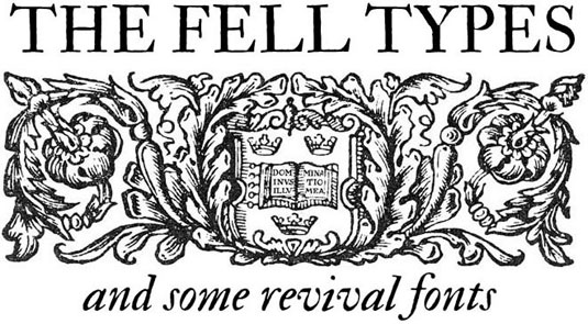
Italian designer Igino Marini has been creating and advancing the Fell types for over 10 years. The typeface is named after John Fell, a Bishop of Oxford dating back to the 17th Century. Marini was inspired Fell's unique collection of printing types and the Bishop's creativity and adventure when it came to the art of typography. Igino also runs iKern,a service for autospacing and autokerning digital typefaces based on a mathematical model and programs he has developed since 2002. Phew! It sounds like the man definitely knows his typography.
FORMAT: OTF
83. Infinity
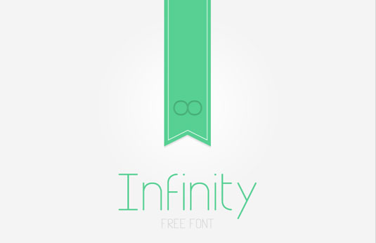
Thai graphic designer Tarin Yuangtrakul mainly focuses his work on illustration, which has been exhibited in Bangkok, South Carolina and New York City. At the tender age of 20, Tarin is already making waves on the design circuit. Here, Tarin turns his hand to typography to create Infinity.
FORMAT: TTF
84. Nosegrind
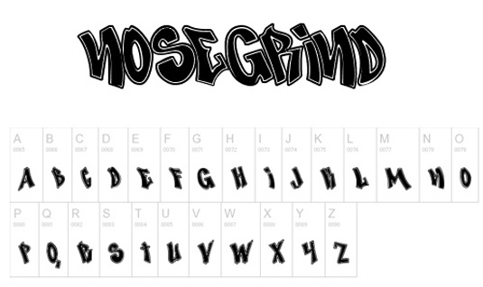
This cool design comes from Scriptorium Fonts, an Austin, Texas-based type foundry started in 1992 by game designer, editor and historian Dave Nalle. Describing the typeface, Nalle says on his website, "Nosegrind is based on skate-culture graffiti gleaned from various samples of similar style found on walls in Austin and online."
FORMAT: TTF
85. Rex
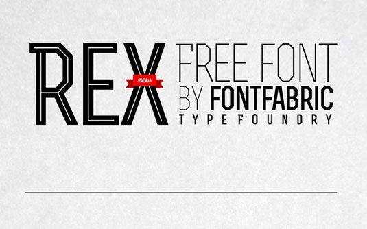
This three-weight font type is brought to you by the folks at Fontfabric. Designer Svetoslav Simov, who is based in Sofia, Bulgaria, founded the independent type foundry back in 2008. Every week, a typeface is rolled out of production and is put up on the site to download absolutely free. Rex is one of those fonts, designed in three weights: light, bold and bold inline. It’s a caps font, but there is a difference between both caps and small caps, which can be seen in the examples on the website. It's available for both personal and commercial use.
FORMAT: OTF
86. Haymaker
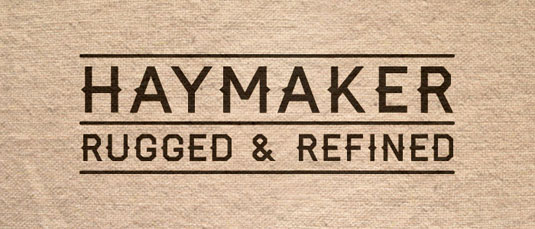
Designer Trevor Baum created this vintage-inspired typeface. Proclaiming a love of bicycles, type and Jewish delis, Trevor wanted to create a font that was both rugged and refined, and we think he's got the balance spot on. The inspiration for the typography design came from the workmanship, lettering and baseball jerseys of the 1930s and 1940s. The font comes in uppercase, lowercase, numerals and also contains punctuation.
FORMAT: TTF
87. Carton
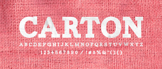
Here's another awesome find on Lost Type, the typography co-op that ensures its designers receive 100 per cent of the donations given for their fonts. This time, the typeface comes from talented Newcastle based graphic designer Nick McCosker. It only comes in upper case but we think that's all a typeface of this kind needs. It's immediately striking to the eye and will work really well with any titled-based designs; possibly less so in body text.
FORMAT: OTF
88. Josefin Sans & Slab
Santiago Orozco created this typeface, with the goal of making it geometric, elegant and kind of vintage - especially for titling. It's based on Rudolf Koch's Kabel (1927), Rudolf Wolf's Memphis (1930) and Paul Renner's Futura (1927). The x-height is half way from baseline to caps height, unlike any other modern typeface. Santiago wanted to do something different with the ampersand, so he made three and will include them in later versions of the Josefin Sans. It took Santiago around a month to draw the total of 373 glyphs.
FORMAT: OTF
89. Nevis
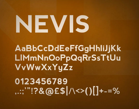
Nevis is another fantastic typeface brought to you by Ed Merritt of Ten by Twenty. The website description is spot on: "Nevis is a strong, angular typeface and is ideal for headings, text, buttons and everything in between. It's assertive and bold, but manages to retain a friendly tone, and looks especially good when used in all caps." The font can be used for both personal and commercial purposes but it cannot be redistributed or sold. Although you can download the font for free, Ten by Twenty say they always appreciate a donation, however small. If you can't do that, a link back to the site is hugely appreciated!
FORMAT: TTF
90. PLSTK
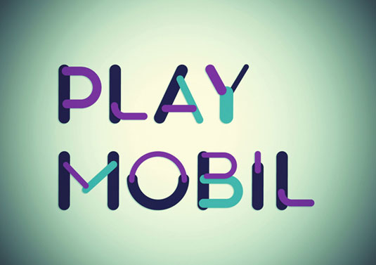
This font was created by Christian del Moral and Luis Armesilla. Both Madrid-based designers, Luis mainly focuses on motion and graphic design, but has a special interest in typography and lettering. Christian is heavily influenced by music and tends to illustrate in a child-like old school way. The designers are happy for you to use the font in any way that you wish. All they ask is that you send them an image of your work once you're done with it! Take a look at this awesome video the guys created to showcase PLSTK's capabilities.
FORMAT: TTF
91. Abraham Lincoln
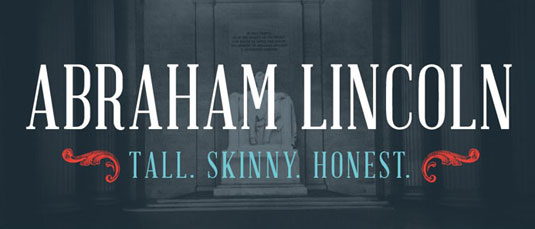
There are no vampire hunters in sight, we're afraid; just an awesome font created by designer Frances MacLeod. Originally from Wichita, Kansas, Frances creates stunning typography and has worked with book covers, leaflets, posters and more.
She created this Abraham Lincoln font to resolve a constant search for a condensed serif. The promotional specimen featurrs the font in use and folds out to a poster of Abraham Lincoln's address to the 166th Ohio Regiment in 1864 on the reverse. You can see the examples on herpersonal website.
FORMAT: TTF
92. Fat Frank
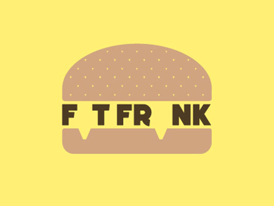
Fat Frank is a fun typographic design from graphic designer, illustrator and typographer Jeff Schreiber. The font is a big-boned and funky font with all digits, some diacritical marks, most punctuation marks and money signs that matter. Jeff also states that those who use this in Photoshop should make sure that the kerning is set to 'Metrics' not 'Optical', otherwise the kerning doesn't work. You'll find it in the Character window. We think Fat Frank would look stunning on print design - especially titles. It may be a bit too chunky for normal body text.
FORMAT: TTF
93. Ostrich Sans
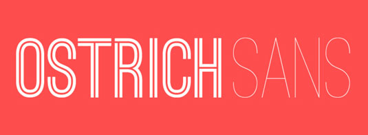
And finally, we have this superb typeface created by New Yorker Tyler Finck. Tyler has created a number of fonts and regularly allows designers to download them for free. He describes Ostrich Sans as an open source font family that he's very happy to offer for free from The League of Moveable Type. The typeface comes in six styles, including Sans Light, Sans Regular, Sans Bold and Sans Rounded. It only comes in caps but we think that it's the perfect font to make an instant impact.
FORMAT: TTF
94. Nougatine
First up in our list of best free fonts is Nougatine. Designed by 25-year-old Frenchman Fabien Laborie, the graphic designer describes Nougatine as "a titling font inspired by the smell of freshly baked cookies." Delivered with 380 glyphs, a host of varying ligatures and a panel of alternative letters, it enables the power of versatility. Used for editorial and commercial purposes, Nougatine is a great all-rounder.
FORMAT: TTF
95. Valentina
Produced by Spanish typographer Pedro Arilla, Valentina is described as a sincere tribute to his grandmother; which is where the name also stems from. A self-professed minimalist, Pedro created Valentina as a classic didone. Incorportating many antique Spanish techniques with influences of Bodoni, Valentina is great for editorial purposes. It is compiled of 457 glyphs, with 125 alternative lower cases or the 46 ligatures. With that flexibility, it really is up there with the best free fonts available.
FORMAT: OTF
96. Chunkfive
Chunkfive derives from the team at The League of Moveable Type. With a motto of providing only the best fonts within the interweb, Chunkfive is a perfect example of their high standards. An ultra-bold slab serif, Chunkfive has all the ingredients for great headings and titles. The fact that it also contains lower case means that it could also work in body set text. If you're looking for a vintage Americana feel, then Chunkfive is your guy.
FORMAT: OTF
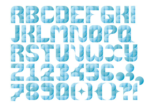
97. Nomed
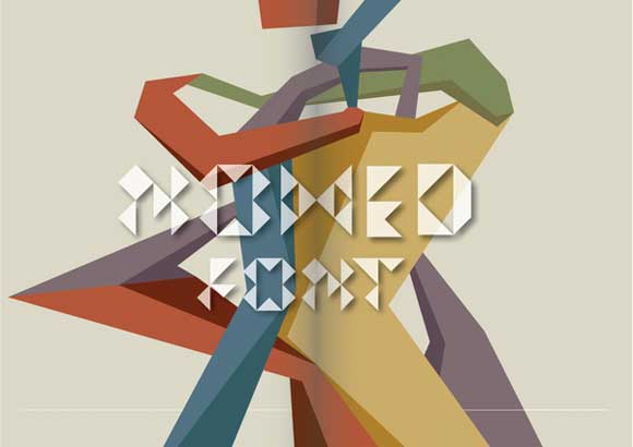
Created by Medness, Nomad is one of the most unusual fonts we've seen at Creative Bloq. Based on a geometric triangle, Nomed really packs a punch when layered. The font is perfect for compositions and comes in simple selections of capital and lower case lettering. If you're looking for a way to standout, Nomed may be the font for you.
FORMAT: OTF
98. Forum
Designed by Russian graphic designer Denis Masharov, 'Forum' is just one of the many fonts this man is responsible for. Currently working for Time Out Moscow, Denis has been a professional typographer since 2008. The font's intended use is for headings and titles, but we're sure it would look great in set body text too! It's classic feel is clear to see, with its clever arches and direct lines. If you love this font, we suggest you check out the rest of Masharov's creations. The man's a genius!
FORMAT: Google Web Font
99. Cassannet
Released earlier this year, Cassannet is a gorgeous addition to our best free fonts list, which captures the essence of vintage Cassandre posters. The art deco typeface is available in bold, regular and outline weights. Containing ligatures, capitals, numbers, small capitals and also titling alternates, the font will be perfect for any purpose. You can be really nice and offer a donation to the makers or simply repay them with a tweet.
FORMAT: OTF, TTF
100. Accent
Brazilian graphic designer Nelson Balaban is known for his outlandish style and fun approach to typography. Accent is just one example of his exemplary work that has been featured in many editorial and commercial campaigns. On first impression, Accent could look a tad on the hipster side but we love it and we think you should too. If you end up using the font, all Nelson asks is that you don't alter it, give credit where it's due and use it to create some "kick-ass work". Off you go then!
FORMAT: TTF
101. League Script
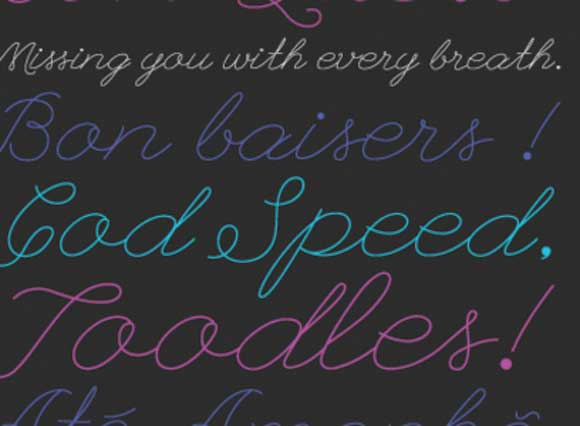
Brought to you once again by those folks over at The League of Moveable type comes League Script. A gorgeous rendition of teenage girl's endless diary entries, League Script offers a sweet alternative to boring body text. Designed by Haley Fiege, it includes ligatures and will act as the framework for future script designs. It's popularity is apparent; having been downloaded a whopping 71,000 times. How will you use it?
FORMAT: OTF
102. Henry
We at Creative Bloq love a blast from the past and this Henry font couldn't be more retro if it tried. Created by Polish graphic designerMarta Podkowi?ska, the font was named after Henry Ford and inspired by all things '60s. Marta mainly cites the fonts major influence from vintage cars, which can be seen in its glorious curvature. Although the font only comes in upper case, we think it would be perfect for headings and titles, and a great chance to test your design abilities.
FORMAT: TTF
103. The Pricks
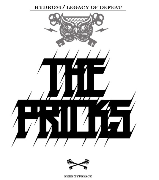
We love this simple block font with mean spikes by Orlando-based designer Hydro74 aka Joshua M Smith. The design is just one of many typefaces Hydro74 has come up with. While many of them you have to pay for, the generous designer also has a bunch of brilliant free fonts up for grabs on his site.
FORMAT: OTT, TTF
104. Bobber
More vintage? You bet! Bobber is a classic font developed by Brazilian typograher Lucas Perdido and Russian graphic designer Dmitry Goloub. Described as an "alternative slab serif", the font is totally free and the guys are happy for you to use it for commercial purposes. We think it'd look create on an illustration portfolio, for those of you that love all things vintage!
FORMAT: Ai
105. Lavanderia
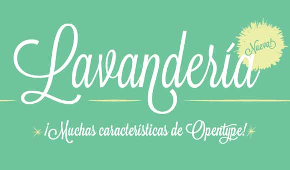
Created by designer James T. Edmondson, Lavaderia is a charming font that takes influence from the Laundromat windows of San Francisco's Mission District. It comes in a range of open type features and three weights. Working as a script font, Lavanderia will really work well as a heading type as well as being able to slot nicely into the set body text.
FORMAT: OTF
106. Sketchtik Light
This cute font is taking us back to our school days. Designed by Hiekka Graphics founder Ossi Gustafsson, Sketchtik echoes chalk boards from the classroom without looking immature. It'll give a sense of fun to any design, which could work well for portfolios or branding. The font comes in light, regular, bold and black so there's plenty of versatility for titles, headings and set body text. (You only get the Light version for free.)
FORMAT: OTF and TTF
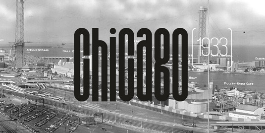
107. Metropolis
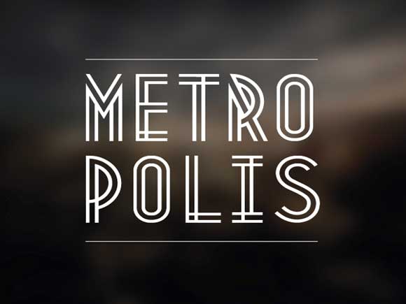
It's no wonder this font has become so popular, thanks to its modern twist on a vintage style. Designed by Australian graphic designer Josip Kelava, Metropolis is influenced by the industrial movement of the 1920s. Kelava wanted to create his own Art Deco font without being too much of a copycat. The result was this bold and daring typeface, perfect for catching your user's eye. It only comes as capital letters, so it won't be relevant for set body text. It does however, look amazing on a poster or homepage!
FORMAT: OTF
108. Alphageometry
Since we've given you plenty of upper case fonts, we thought we'd delve a little deeper and focus on the little guys. Alphageometry is a set of simple yet effective decorative typefaces created by Canadian designerMarkie Darkie (aka Ferdinand Mark Basa.) Letterforms were designed using simple geometric shapes in a 10x10 square grid structure guide. Please note that the font is in vector format, which means each letterform will need to be hand set and composed. Who knew lower case letters could be so powerful?
FORMAT: EPS and Ai
109. GRN Burgy
Created by Italian designer Marco Goran Romano, GRN Burgy is a fun take on early American graffiti. Another big influence on the font is fast food culture, which is reiterated in the 'shiny' effects used. If you don't want to take yourself too seriously, have a go with GRN Burgy. The direct lines combined with extreme curves makes the font ooze creativity. GRN Burgy only comes in capital letters, so it's only really useful for titles and headings on homepages or posters.
FORMAT: OTF
110. SciFly Sans
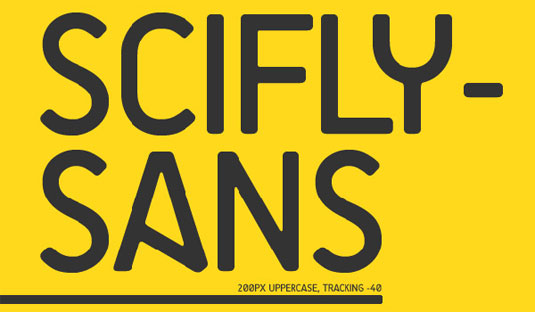
Tomi Haaparanta, the famous and prolific font designer from the Suomi Type Factory, has created a new typeface, commissioned by Flyerzone. Anyone can download and use SciFly Sans within their projects to create a unique style.
FORMAT: OTF


헉.. 엄청 많군요. 영문폰트인건 함정이네요.